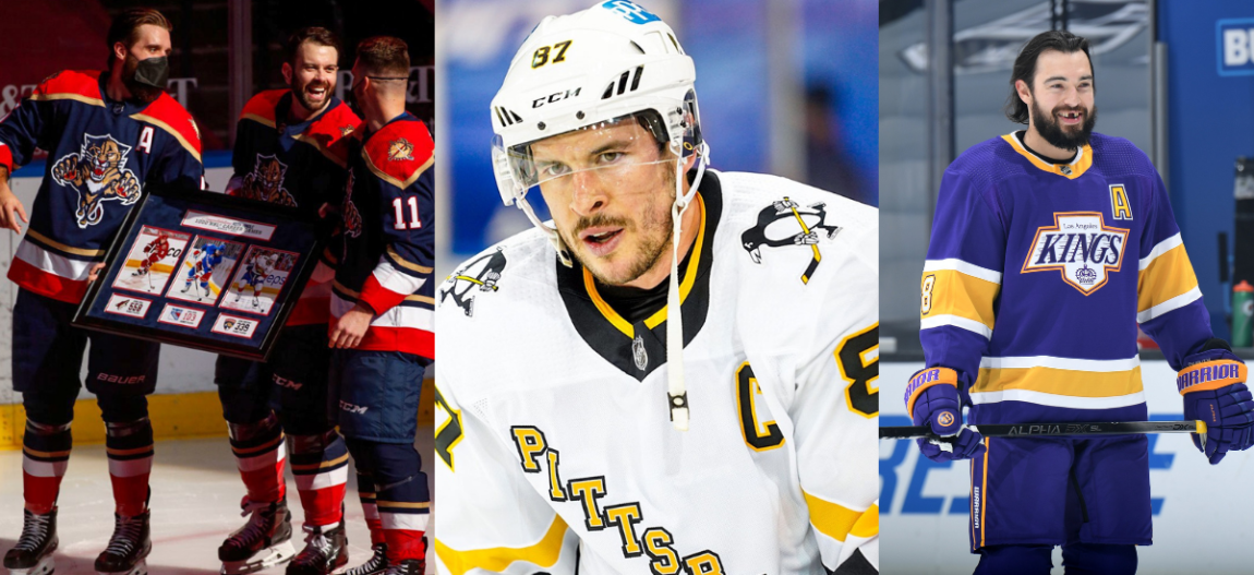
After the conclusion of the 2020 bubble postseason, the NHL announced the arrival of “reverse retro” jerseys. The basic idea for the jerseys was to take a uniform style from some time in each franchise’s past and shake it up a bit.
Some franchises used this concept as an opportunity to go all-out and create some funky, borderline over the top, jerseys. Other teams made their reverse retro jerseys more of a salute to a former uniform. And then there is a group of teams that either had little to work on given their franchise’s historically mundane approach to curating NHL sweaters, or just straight-up did not feel like putting much effort into the project.
Here I will discuss which teams did the best job creating reverse retro jerseys, and which came up short. I have intentionally waited until enough time has passed in the 2021 regular season (we are at about the halfway mark now) in order to see each team in action in their respective reverse retro jerseys. Because quite frankly, some of my rankings changed quite significantly once I was able to see each design in all of its glory.
The Ugly Ducklings of the Reverse Retro Jerseys (31-27)
I lumped this group of reverse retro jerseys together for two reasons. Either the franchise did very little to alter the uniform from a past iteration, or they just missed the mark with the design entirely.
31) New York Islanders
30) Vancouver Canucks
29) Toronto Maple Leafs
28) Detroit Red Wings
27) San Jose Sharks
The obviously problematic jersey here is the Islanders’ “reverse retro”. This jersey reeks of laziness. Either the organization put 5% effort into this project or someone with some authority said “we are not participating in this”.
When these jerseys were released jokes were immediately made about GM Lou Lamoriello having some influence on the project. Lamoriello is notoriously known as a straight-edge, no-nonsense guy who isn’t a fan of off-ice distractions. This makes it all the more believable that the three-time Stanley Cup-winning exec had more than a little influence on this Isles jersey.
All of this is particularly frustrating to Isles fans who wanted to see a revamp of the fisherman logo from the ’90s, and it is peculiar why the team decided not to make this jump when the organization is seemingly fine with promoting the logo in other capacities.
When the Canucks first announced their reverse retro jerseys I was intrigued by the boldness of creating a jersey with colors that fade into one another. Generally I will give more respect to a team that is willing to try something new rather than cower and produce a bland jersey. But in the case of the Canucks, these jerseys really just missed the mark entirely.
As far as the Toronto Maple Leafs, Detroit Red Wings, and San Jose Sharks are concerned, these jerseys are really just too boring to enjoy. I am not a fan of gray in hockey jerseys at all and both the Sharks and Leafs have A LOT of it.
The Red Wings literally just slapped their traditional logo on a white jersey and called it a day, so they have no choice but to be lumped into this category. The all-white jerseys with red pants actually don’t look bad at all, it’s the lack of creativity that puts them among the worst of the worst.
Still Just Not Quite Doing It (26-21)
With this set of reverse retro jerseys you can tell there was at least some creative energy put into the design process, but for the most part, these uniforms just don’t quite hit the mark.
26) Nashville Predators
25) Winnipeg Jets
There is something about the sleeves on these Predators jerseys that just don’t work, and the off-white paired with the yellow in this design really isn’t appealing. As far as the Jets’ threads go, these jerseys make better use of gray than those of the Sharks and Islanders, but alas, gray in hockey jerseys can only be so good, even paired with a clean logo.
24) Buffalo Sabres
23) Philadelphia Flyers
22) Tampa Bay Lightning
21) St. Louis Blues
This section is bound to garner some criticism, but I will start by saying that the only reverse retro jerseys among this group that are as bad on the ice as they were when they were modeled for the NHL’s announcement in the fall are those of the Nashville Predators.
Every other team in this category has had a glow-up for me. And by that I mean when these jerseys were first announced I was not a huge fan, but seeing them on the ice on their respective teams has warmed me up to them a bit.
The Sabres reverse retro jersey is nearly there as far as style goes. The gold and blue bands are stylish, but the crossing swords minus the buffalo head leaves this logo feeling like it needs another element to bring it all together. Philadelphia and Tampa don’t move the needle much. I wish the Lightning as an organization would experiment a bit more with a design that hasn’t changed much since the team entered the league.
While I appreciate the boldness from St. Louis, these jerseys straight up miss the mark for me, the red and blue feels chaotic even though the threads in general exude a very retro vibe.
Some Love Them, Some Hate Them (20-15)
This section is a mix of classics and bold attempts at shaking up the traditional style of an NHL jersey. In this category we begin to get into some sweaters that are beloved by some fans, yet despised by others.
20) New Jersey Devils
It might surprise some that I listed these Devils jerseys as high as I did. Because, quite frankly, not a ton was done to shake up these occasionally nicknamed “Christmas jerseys”. But honestly, the colors are clean, and I think these jerseys fly under the radar as a stylish, without straying from the roots of the organization.
19) Carolina Hurricanes
18) Calgary Flames
Both the Calgary Flames and Carolina Hurricanes played off heavy fan nostalgia with their reverse retro jerseys. The Hartford Whalers logo is undeniably a classic, but personally I am more interested in the Hurricanes organization marketing the team they have now in Raleigh, instead of playing off the memories of an organization that has been defunct for nearly 25 years.
The Flames’ “Blasty” jerseys have been the center of quite a bit of controversy. I like the idea of an all black uniform, but I’m not a huge fan of the logo to begin with. I’m sure this jersey has sold well, but it is a lot to stomach even after seeing it on the ice.
17) Blue Jackets
16) Dallas Stars
15) Vegas Golden Knights
The Blue Jackets, Stars, and Golden Knights all debuted uniforms that were bold and different. But each of these uniforms lacks one key element that would put them over the edge for me.
When the Blue Jackets first released their reverse retro jerseys I was a big fan. But after seeing these jerseys on the ice, I just can’t quite shake the feeling that one thing is missing. Something about the white shoulders is a bit bland, and might benefit from a defining line or some sort across the top of the primary red color.
By virtue of being all white, the Dallas Stars’ reverse retro jersey was bound to garner some criticism. Having white jerseys on white ice is going to draw complaints from the same crowd that has a hard time tracking the puck on television. Otherwise, as far as white jerseys go, I’d say the Dallas hit it out of the park.
I wanted to make sure I added some context for the Vegas jerseys so no one complains about how a team that is less than five years old could really have a reverse retro jersey. The logo is solid, the “V” shaped design works. But something about the color scheme is slightly off-putting. Overall, a solid attempt from an organization that has shown it isn’t afraid to go big or go home.
Those Jerseys With the “Classic” Feel (14-6)
Now we’re getting into the section of reverse retro jerseys that give off a truly classic NHL vibe. Iconic logos, minimalist color schemes, and even a nod to a former organization, the section has it all.
14 ) Pittsburgh Penguins
13) New York Rangers
Admittedly, I wasn’t a huge fan of these Pittsburgh Penguins jerseys at first. But the diagonal name of the team on the front of a white jersey with yellow stripes finished off with black sleeves just works. My only gripe is that these jerseys feel way too similar to the Rangers’ diagonal design to not feel like somewhat of a rip-off.
And speaking of the Rangers, I know many fans were excited to see the return of the Lady Liberty logo on the reverse retro jerseys. This logo is one of the best alternate logos in the league, and while the color scheme itself is a bit bland, that is expected from an original six franchise. Sometimes less is more.
12) Ottawa Senators
11) Edmonton Oilers
Easily one of the best branding moves from any organization in recent NHL history was the Ottawa Senators’ decision to return to the franchise’s original Senators logo. Both Ottawa’s home and away jerseys along with the reverse retros sport this logo, and matched with the unique bright red and black stripes, this jersey is a classic.
Speaking of classics, these Edmonton Oilers reverse retro jerseys might be seen as bland at first glance, but something about uniform is just super clean. The thin blue and orange stripes on a white jersey, paired with the orange shoulders just gives a real old time hockey vibe. These jerseys fly under the radar as a sneaky great uniform.
10) Minnesota Wild
Talk about a jersey that has gotten people talking. The Minnesota Wild reverse retro jerseys harken back to the days of the Minnesota North Stars. The North Stars, now the Dallas Stars, were famous for this yellow and green color scheme.
The Wild, despite having no affiliation with the franchise minus the fact that both teams have represented Minnesota, decided to add their own twist to the North Stars’ brand, slapping their own logo on a classic North Stars look. I might have ranked these jerseys higher if the color scheme wasn’t so jarring.
These jerseys do grow on you I have to admit, but I wasn’t around when the North Stars existed so there isn’t a nostalgia factor here for me. These reverse retros are solid, but not deserving of the immense praise they have gotten from those who grew up watching the North Stars on television.
9) Boston Bruins
8) Chicago Blackhawks
7) Montreal Canadiens
6) Washington Capitals
From the Boston Bruins to the Washington Capitals, all four of these reverse retro jerseys display classic retro vibes. The Chicago Blackhawks’ use of black in their reverse retro jerseys is absolutely stellar, and the Montreal Canadiens’ blue jerseys are as clean as they get.
I have heard from some of the Canadiens fans in my life that they aren’t necessarily a fan of the blue jerseys, but to me there are few blue jerseys across the entirety of the National Hockey League that look as good as these do, both in concept and on the ice.
You could have told me any of these four jerseys was actually from the ’70s, ’80s, or ’90s and I would believe it 100%. If I was a teacher grading NHL franchises on their ability to adhere to the assignment, each of these four would get an A+.
The Final Five
My top five best reverse retro jerseys represent all of the categories I have discussed above. The classic, the bold, the nostalgic, and the straight-up original. Each one of these jerseys excels in a category of its own, therefore making it deserving of a spot in the final five.
5) Anaheim Ducks
There are some absolute nuts out there that live and breathe all things Might Ducks. And while I understand the childhood nostalgia associated with this brand, I was personally not someone who grew up on the Mighty Ducks, and that likely factors into my decision to place these jerseys at No. 5 and no higher.
Additionally, the Ducks went bold with the decision to place an entire animated Duck on the front of these uniforms, emerging from the bottom of the jersey and working its way up. I appreciate the attempt at creativity, but something about this logo is slightly jarring to me.
4) Colorado Avalanche
I mentioned above my distaste for jerseys that played off the threads of a former franchise, but there is no ignoring the clean and classic look of these Quebec Nordique-inspired reverse retro jerseys from the Colorado Avalanche.
The Colorado maroon, matched with the Nordique logo was born to be a success. Not to mention the fact that unlike the North Stars and Whalers, there is still a massive desire from the Quebecois to see the Nordique logo branded again in their home town.
3) LA Kings
So a small history lesson for those who are as oblivious as myself, the LA Kings first entered the league donning these purple (actually Forum Blue) and yellow jerseys to match the LA Lakers back in 1967. This color scheme remained until the arrival of Wayne Gretzky in 1988. The organization then transitioned to its black and silver colors that are well known today.
Such a significant transition in colors is not common in the NHL, and while the Kings never saw much success in their Forum blue uniforms, the sentimentality of these jerseys is undeniable. Not to mention the fact that they look super clean on their own. These factors combined place this jersey solidly in my top-three.
2) Florida Panthers
When the Florida Panthers first announced their rebranding back in 2016, I wasn’t among those sad to see the original panther logo go. To me, the leaping panther was outdated and represented an organization that just hadn’t had very much on-ice success.
That being said, when the Florida Panthers announced their reverse retro jerseys, and the plan to bring back the original panther logo and a familiar, yet modified, color scheme, I was sold.
What makes these jerseys work so well is that all of the colors incorporated into this design are different, and on their own aren’t anything special. But thrown together into this very specific design, these colors are magnificent.
Any complaint a jersey snob might have, from the sleeves to the shoulders to the logo, is quelled on this jersey. These jerseys are a home run in every sense of the word to me. The Panthers stuck to the assignment, fixing design and color flaws that have plagued this jersey for years, finally finding a combination that simply works.
1) Arizona Coyotes
For an organization that has been plagued by a myriad of issues both on and off the ice for well over a decade, one thing you can’t say about the Arizona Coyotes is that they are a poorly dressed franchise. From the team’s classic Kachina jersey, to these bold, yet tasteful, reverse retros, the Arizona Coyotes might actually be the best-dressed team in the NHL.
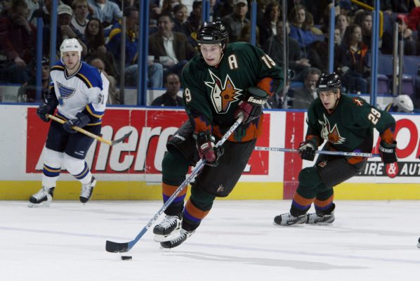
These jerseys originated from a green alternate Coyotes uniform the then Phoenix Coyotes wore in the late 90s into the early 2000s. But the usage of purple from the team’s crescent moon logo is a welcome modification to the ugly green original.

I wasn’t originally a fan of these jerseys upon their release, but the more you see them the more they grow on you. These uniforms also look stellar in on-ice action. Kudos to the Coyotes from taking one of the ugliest jerseys in league history and transforming it into one of the NHL’s most iconic.
Interested in reading more? Head over to our blog section & make sure to follow us on social media below!


